Why Streamers Need to Design for Mobile First - Not Their Own Laptop Screens
Most streamers design their profiles on wide desktop screens, but about 70% of viewers see them on narrow mobile screens. What looks perfect on your laptop can become messy and hard to navigate on a phone, costing you engagement and tips. StreamerSuite’s mobile-optimized themes ensure your profile looks clean, readable, and professional on any device, keeping your audience hooked and your brand consistent.
If you are like most streamers, you probably check your profile on the same device you stream from. For the majority of people, that means a laptop or desktop with a wide monitor. You pull up your profile in a nice big browser window, everything looks perfectly arranged, your graphics sit exactly where you want them, and you feel confident that your viewers will see the same thing.
Here is the problem - they don’t.
Around 70% of your viewers are not looking at your profile on a big widescreen monitor. They are on a mobile phone with a narrow screen, scrolling with one thumb, and seeing a very different version of your carefully crafted profile. That beautiful design you created on your laptop can collapse into a cluttered mess when it is squeezed down to a fraction of the width.
This is one of the most overlooked mistakes streamers make when setting up their online presence. And it is one of the easiest to fix when you understand why it happens and how to design with mobile in mind from the start.
The Numbers You Cannot Ignore
It is easy to underestimate just how dominant mobile viewing has become in live streaming. Most analytics platforms, including Chaturbate’s own data, show that roughly 70% of traffic comes from mobile devices. That means if you have 100 people watching or checking out your profile, 70 of them are on a phone or tablet.
Even more striking is the mismatch in how streamers build their content versus how viewers consume it. The overwhelming majority of streamers - easily 99% - stream from a laptop or desktop computer. That is understandable because a bigger screen and proper hardware make it easier to manage your broadcast. But it also creates a dangerous blind spot.
When you are looking at your own profile on a wide screen, you are seeing a completely different version than most of your audience. It is like designing a poster to be displayed on a billboard and then discovering that most people are actually looking at it printed on a business card.
How Wide Screens Distort Your Perception
When you view your profile on a laptop or desktop, you are benefiting from:
- A wide aspect ratio that allows horizontal elements to sit comfortably side by side
- More whitespace around images and text
- Plenty of room for large banners or graphics without them feeling overwhelming
- Easy-to-read text blocks that do not wrap awkwardly
The moment that same layout is scaled down to a phone screen, several problems occur:
- Content Stacks Vertically - Sections that were side by side now sit on top of each other, which can push important content far down the page.
- Images Shrink or Break - A banner that looked crisp and professional on desktop can become tiny and illegible, or it may get cropped in strange places.
- Text Becomes Harder to Read - Paragraphs that were neatly contained suddenly feel endless because they take up more vertical space.
- Buttons and Links Get Buried - Calls to action can disappear below less important elements, forcing users to scroll past clutter before they see them.
From your point of view on a laptop, none of these issues are visible. You see a clean, balanced design. But your mobile viewers may be struggling to make sense of a page that feels disorganized and overwhelming.
Why Mobile Users Matter the Most
Even if you do not personally browse stream sites on your phone, your audience’s habits should shape your design decisions. Mobile viewers are often:
- More spontaneous - They click on your profile while casually browsing and will leave quickly if the layout feels confusing.
- Less patient - On a small screen, it only takes a few seconds of frustration to swipe away and check another streamer.
- Focused on quick interactions - They want to see your content and understand what you offer immediately, without scrolling through excessive decoration.
That means your mobile layout has to deliver clarity and appeal in seconds. A great-looking desktop profile that turns into a chaotic mobile mess can cost you followers, tips, and long-term fans.
How to See Your Profile the Way Your Viewers Do
Before you redesign anything, you need to see what your viewers are seeing. Here are a few ways to check:
- Use Your Own Phone - The simplest option is to pull up your profile on your phone and scroll through slowly.
- Resize Your Desktop Browser - Grab the edge of your browser window and shrink it until it is phone-width. You will instantly see elements stacking and shifting.
- Use Mobile Emulation Tools - Most browsers have a built-in “responsive design” mode that lets you view your site as if it were on a phone.
- Ask a Friend to Screen Record - Have someone browse your profile on their phone and send you a video so you can watch the full experience.
This exercise can be eye-opening. It often reveals that graphics you thought were attention-grabbing are actually illegible. It shows that important buttons are far down the page. And it highlights how text that looked compact on your laptop now feels like a wall of words.
The Challenges of Mobile-Friendly Streaming Profiles
Creating a profile that works equally well on mobile and desktop is harder than it sounds. Streaming platforms were not originally built with advanced responsive design in mind. They give you a limited set of customization tools, which can make it tricky to balance visual appeal and usability across different devices.
Here are some of the main challenges:
- Fixed-Width Graphics - If you upload a banner at a certain size, it might look perfect on desktop but awkward on mobile.
- Overlapping Elements - On mobile, some sections can shift in ways that cause images and text to overlap, creating an unprofessional appearance.
- Font Scaling Issues - Text that looks stylish on a wide screen can become tiny or unreadable on a small one.
- Layout Breakage - Complex designs made with multiple columns often break entirely when compressed to a narrow screen.
Without a deliberate mobile-first approach, you can end up with a profile that is visually appealing to you but frustrating for the majority of your visitors.
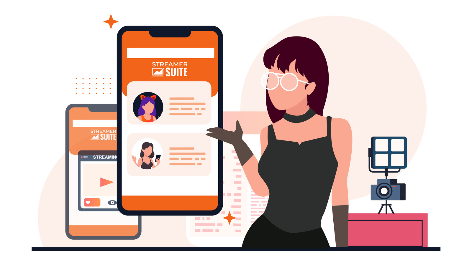
Why StreamerSuite Solves This Problem
This is exactly where StreamerSuite’s profile design service comes in. Every theme we create is fully responsive, meaning it automatically adapts to the size of the viewer’s screen. Whether someone is viewing your profile on a widescreen desktop monitor, a laptop, a tablet, or a small phone, the layout is optimized for clarity and impact.
We design with a mobile-first mindset. That means:
- Text remains readable without zooming
- Images scale proportionally without distortion
- Important information stays above the fold so viewers see it immediately
- Call-to-action buttons remain prominent no matter the screen size
- Whitespace is balanced to keep the design clean and easy to navigate
When you use a StreamerSuite theme, you are not just getting something that looks good on your own laptop. You are getting a design that works for the 70% of your audience who are visiting from a phone. That difference can directly impact your engagement, tips, and overall fan growth.
If you want to see exactly how our themes handle this challenge, take a look at our mobile optimized profile designs and compare them to what you are using now. The difference will be obvious.
How Mobile Optimization Improves Engagement
A mobile-optimized profile does more than just look neat. It changes how people interact with your content:
- Faster Understanding - Mobile visitors can immediately grasp what you offer without unnecessary scrolling.
- Higher Click Rates - When buttons are easy to find and tap, more people will click them.
- Longer Session Times - A clean layout encourages users to explore more of your content.
- Better First Impressions - Viewers are more likely to follow or tip when your profile feels professional and easy to use.
Even small improvements in mobile usability can lead to measurable increases in engagement and revenue.
Avoiding the Common Mistakes
If you want to keep your profile looking great on mobile, here are a few mistakes to avoid:
- Using too many large graphics - They take up valuable space and push important content down.
- Overloading with text - Break content into short, scannable sections.
- Hiding important links at the bottom - Keep calls to action near the top where they are visible without scrolling.
- Ignoring load times - Heavy designs can load slowly on mobile connections, causing visitors to leave before seeing your content.
StreamerSuite’s themes are built to automatically avoid these pitfalls, but if you are customizing your own profile, these are points to keep in mind.
Testing and Updating Regularly
A mobile-friendly design is not something you set once and forget. Platforms change their layouts, you add new content, and your audience’s device preferences can shift over time. Make it a habit to:
- Test your profile on different devices every few months
- Watch how new elements affect the mobile experience
- Keep graphics updated and sized for multiple screen widths
- Adjust your calls to action to stay visible and relevant
Think of your profile as a living part of your brand that needs regular attention - not just a one-time setup.
Final Thoughts
If you are a streamer who has been designing your profile entirely from a laptop or desktop perspective, it is time to change your approach. The majority of your audience is seeing a completely different version than you are.
Designing with mobile in mind is not just a nice extra. It is essential if you want to connect with the 70% of viewers who browse from their phones. Without it, you risk losing potential fans simply because your profile is hard to navigate on the devices they use most.
With StreamerSuite’s mobile-optimized themes, you can be confident that your profile will look great and function perfectly on both mobile and desktop. That means you can focus on streaming while knowing your brand is making the right impression every time someone visits.
Your laptop might be where you create, but your mobile viewers are where you grow. Make sure your profile treats them like the priority they are.